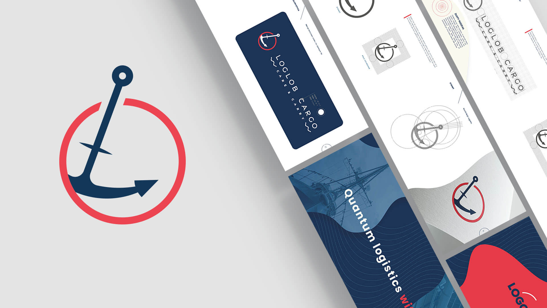
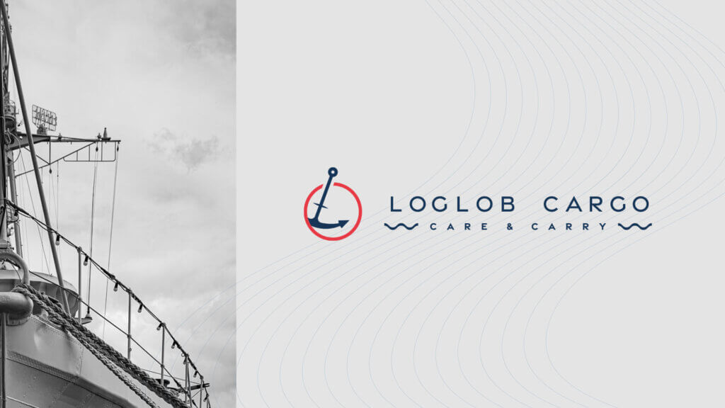
Our task was to prepare a visual identity and logo for a newly established shipping company specializing in sea transportation. From the very beginning, the client was strongly attached to the idea that the anchor should be the main element of the logo. Several sketches with this very motif quickly led us to a satisfactory look for the logo.


The scope of the order, in addition to creating a logo, also included preparation of visual identity, with basic elements such as business cards and rollups for the upcoming trade fair. There was not much time, but thanks to great contact and quick decisions, we managed to complete the order. Working on this task It was a great experience.
As for the logo, we tried to use the golden division. I really like this approach when it comes to creating a logo. This method allows you to arrange even the most bold guidelines coming from the client. In addition, it is good for stimulating the imagination.


